Power BI Slicer: A Beginner's Guide
The great thing about Power BI slicers is that you can completely change the way they look. They could look like buttons, dropdowns, lists, range sliders, timelines, and even hierarchy slicers.
I'll demonstrate how to make several alternatives to suit various purposes, when to utilize them, and how to go about doing so in your reports. I will also give you some tips and tricks for Formatting and syncing the slicers at the end.
Creating Power BI Slicers
To create a Power BI Slicer, follow these straightforward steps:
1. Open Your Power BI Report
Begin by opening the Power BI report that you intend to enhance with a slicer.
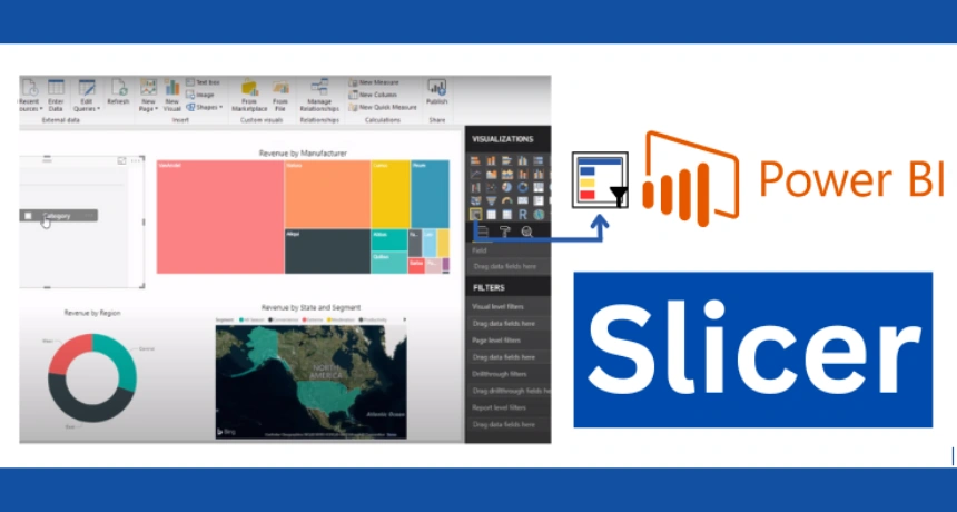
2. Access the Visualizations Pane
Locate the Visualizations pane, which is typically on the right-hand side of the Power BI interface.
3. Select the Slicer Icon
In the Visualizations pane, select the Slicer icon. Performing this operation will produce a slicer object on the report canvas, which may then be rearranged as desired.
4. Place the Power BI slicer on the Canvas
Drag and drop the slicer object onto your report canvas. Position it where you want it to appear within the report.
5. Configure Slicer Field
In the Slicer Editor, choose the field by which you want to filter the data. This field will determine the values available for selection in the slicer.
6. Save Your Slicer
Click "OK" to save your slicer configuration. The slicer will now be displayed on the report canvas.
How to make slicers look like buttons?
Let's start off with buttons. So, over here in Power BI Desktop, I've disguised my slicer to look like buttons.
Let us see how easily can anyone set this up.
Steps to make slicers look like buttons
- The first thing we need to do is add the slicer visual.
- Next, pick the category that you want to have inside the slicer. I'm going to go with Product-Department.
- The default slicer type for text is a list; we're going to change these to look like buttons. Go to formatting options, under slicer settings, change orientation from vertical to horizontal, and you immediately get buttons.
- Now, these are responsive, so if you want vertical buttons, increase the height of your slicer. If you want horizontal buttons, increase the width of your slicer.
Options in this menu
By default, you're able to select multiple categories. If I hold down Control, I can select all four of these. If you don't want the users to be able to do that, you want "single select". There is a setting for that.
Go to Selection and turn on single-select. This way, no one can select multiple values.
In terms of formatting, you have some limited options. For example, you can turn off the slicer header. If it's obvious what the slicer is, you don't need it.
Under Values, you can adjust the font of each button. You could adjust the border: You could make it a bit thicker if you want.
The border color: You can also adjust the background of the unselected categories. So, for example, I could change these to yellow. But then, it can become unclear what is selected and what isn't. So, it's best to go with a color that's similar to your background.
Now, one thing you can also do is turn off all of these borders except the top one or the bottom one. Adjust the color, and you get a more minimalistic look.
List and Hierarchy Slicers
Now, let's take a look at lists and hierarchy slicers. So, start from a blank page again.
List Slicers
We're going to add the slicer visual. Let's add Department again to this; we get a list slicer by default.
Again, you have multi-select on. If you want to turn it off, remember where that is? Under slicer settings, selection, you can turn on single-select.
And if you're dealing with lists, you're going to see radio buttons here instead of square boxes.
If you want to exclude something from your slicer, you can easily do that by clicking right-mouse. Let's say I want to exclude creative arts from showing up in my slicer. I'm going to right-mouse-click on it and select exclude, and it's gone.
If you hover over the filter button here, you can see that there are filters on this visual. Where are these? Well, they're right there. If you open up the filter pane, you'll see these filters were automatically applied here.
You can hide it if you don't want anyone to see that. Now, when you go and hover over filters in this visual, it will say there aren't any filters applied right now.
Hierarchy Slicer
I can easily turn this into a hierarchy slicer if I want. Even if you don't have official hierarchies set up.
For example, suppose I want to be able to drill into a department and go to the next level (which happens to be the main product category). All I need to do is add this to the same slicer.
Let's go back to our default view, and we're going to add the main category and bring it under the department.
When you make a hierarchy, you also get some extra style choices for that hierarchy.
- You can decide how much you want them indented. It's better to have some easily identifiable indentation there.
- You can also decide on the types of icons you want to have on the side. If you're going to have plus or minus or the caret icon.
Dropdown Slicers
You can always switch between the types of slicers you have here. See what you get when you switch this to a dropdown.
To do that: go to Select format, then Slicer settings, then Options, then Style.
The options you had applied before are there. You'll even get your slicer hierarchy in here.
Range Slider for Numeric Slicer
Next up is, range sliders.
Over here, on this report page, I have the total sales for the different products. I want to add a slicer to the product cost. This way, I can quickly take a look at products that are over a hundred dollars.
To do that, let's add our slicer visual and bring over our cost field. Now, because cost is a numeric field, by default, you get a range slider.
Now, you can define your range, and your table automatically updates. Now you have the option of inputting these manually yourself as well or changing your selection from here to only see values that are greater than or equal to.
This way, the top part of the range is grayed out. You can define the bottom part of the range as less than or equal to.
Timeline Slicer
Last stop: Let's take a look at timeline slicers.
I'm going to add another slicer to the same report. This time, I'm going to add a field from my calendar table, and the field has the data type "Date".
Now, the moment you do that, you get a slicer that's similar to our numeric slicer, except that you have the calendar picker available. You can make your selections directly from here or type them in if you want.
In case you add a date and you don't get this view, for example, if I add the date field instead, I automatically get this hierarchy slicer. If you don't want that, just remove the other fields.
Now that I have a date, I will go to this arrow on the corner and switch my view to between. This automatically gives me the timeline slicer.
I can use the slider here to change my selection or use the calendar picker again to adjust my selection. Whenever you're dealing with dates, you also have some more options.
Aside from before and after, as we saw with our numeric slicer, we can also select a relative date or relative time. We could take a look at the last 100 – 200 days, weeks, months, and so on.
How to sync slicer in Power BI across multiple pages?
Okay, so these are the different slicers. But before we wrap up, I want to give you one final tip, and that's how you can sync slicers across multiple pages.
For example, let's say on this page, which is page 4, I want my table to be filtered based on the slicer selection that I made on page 2.
When I select a different department here, I want my table on page 4 to be filtered to that department. I don't need to add a separate slicer for departments here; I can sync this to my original slicer.
- The first thing you need to do is: select your slicer.
- Go to "View" and then "Sync Slicers". You can choose to sync the slicer with all pages or select specific pages.
- This one here is on page 2. It's visible; there's a checkmark here, that's for visibility, and this column is for syncing. I want to sync this and page 4 with each other.
- I have office supplies selected, and when I go to page 4, I get my office supplies: markers, index dividers, and pen and pencil sets.
- When I change my selection to party and celebration, I get to see the products in party and celebration.
- Now, what was that visibility option? If you choose to place the check mark here, all you get is that slicer pop-up on this page as well.
Conclusion
Power BI Slicers:
- Dynamic and versatile for report enhancement.
- Make reports more interactive and user friendly.
- Enable intuitive data exploration.
Effective Usage:
- Understanding when and how to use slicers is key.
- Creating and formatting slicers effectively is essential.
Unlocking Potential: Empower report creators to maximize their value in Power BI.